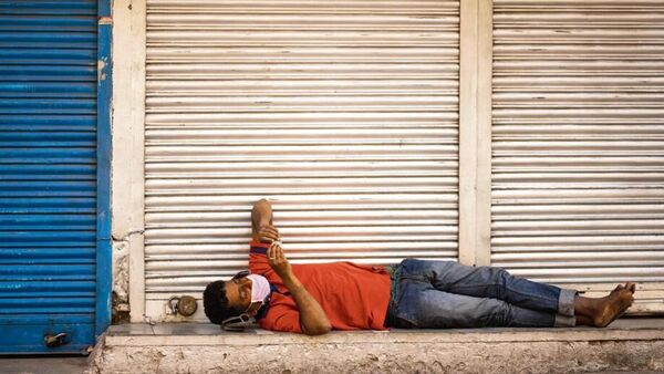
Inequality in India is an old story. But what did the covid shock do to it? The picture remains hazy. Statistical snapshots are no paragons of perfection, but what little data we have does allow low-rez estimations. Consider the impact on poverty. In a new paper, former Niti Aayog vice-chairman Arvind Panagariya and Interlink Advisors founder Vishal More have used expenditure data from the Periodic Labour Force Survey (PLFS) to argue that all-India poverty went up in the lockdown quarter (till June 2020), but declined thereafter for four quarters on a trot. That only one quarter went awry, they contend, squares up well with state rollouts of relief in the form of handouts like free food and rural jobs. While the Centre’s response to the crisis did create an invaluable safety net for the poor, doubts still surround whether its labour tracker offers a better view of how people fared than the more focused consumption survey it scrapped in 2019, a decision that snapped our main poverty gauge and prompted charges of data torture.
We also have a portrait of better-off Indians drawn from income tax data placed in Parliament. Under debate here is how a shrunken count of individuals at the bottom of India’s tax pyramid—with income of under ₹5 lakh—is best interpreted. The most populous by far, this group’s size peaked at 50 million in 2018-19, shrank to 46.3 million in 2019-20 and then again to 41.2 million in covid-stricken 2020-21. In a Mint op-ed (bit.ly/3GelQuF), chief economic advisor V. Anantha Nageswaran and senior bureaucrat K. Balasubramanian point out new tax benefits at this level of income and upward mobility to the next slab as likely explanations, with the earlier enlargement explained by a big formalization drive. In ‘Our View’ published earlier (bit.ly/3ztAfPZ), we had written of pre-pandemic distress, covid as a worsener of it and of a smaller tax base as an anomaly that revealed dropouts: “This defies the usual pattern of emergence from poverty, by which we would expect the under ₹5 lakh group to swell.” Even with upshifts counted, new entrants from below could not make up for that; and while tax-sop claimants might have been numerous, the shortfall still suggests a base-level income crunch, as consistent with surveys like ICE360.
Since inequality is a relative metric, we must look at how the rich fared. As Nageswaran and Balasubramanian argue, India’s income Gini coefficient—by which 1 signifies all of it earned by one person and 0 means everyone earns the same—could well have dropped as a result of fiscal transfers. The Gini, however, compares huge chunks of a vast population, so it offers too distant a view to capture too much going to just a few people at the top of a pyramid. Moreover, the data gets even more blurry as we go upscale. After all, India’s real K-shaped story is about divergent wealth rather than income. Wealth is always far harder to assess with any accuracy. While mark-to-market data that corresponds reliably with actual holdings is scarce, we do know that large swathes of assets soared in value over the pandemic, some of them inflated by the easy money that swirled around the globe after central banks got into rescue mode. Stock portfolios that track market indices, for example, made gains over the relevant period that they arguably wouldn’t have without this episode of asset inflation. This boom lends credence to studies by Oxfam and others that said India’s wealth gap widened after covid. All said, that ‘K’ looks highly plausible. Perhaps further findings will clarify what exactly happened.
Download The Mint News App to get Daily Market Updates.
More
Less
#Kshaped #recovery #story #adds
